Low marks for luxury goods decision
Victor Povid questions the conclusions reached by the EUIPO. B 3 079 736, Elena Sivoldaeva v Aditya Vitthal Choksi & Others, EUIPO, 31st January 2020.

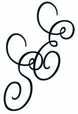
In this decision, the EUIPO Opposition Division (OD) upheld in its entirety an opposition by Elena Sivoldaeva, a designer of “exclusive jewellery” (the Opponent), against the extension of protection within the EU of international registration No. 1434875, filed by Aditya Vitthal Choksi and others (the Holder).

Contested sign
IR No. 1434875
The opposition was based on the single ground of Article 8(1)(b) EUTMR (risk of direct or indirect confusion), and although the decision entailed a straightforward comparison of the respective trade marks and goods using the well-established tests, it appears to this author that the OD came to a questionable conclusion when comparing the marks, which concerned class 14 (jewellery, precious and semi-precious gems, and the like).
Comparison of the signs
The OD carried out a comparison of the marks taking into account a global appreciation of visual, aural or conceptual similarity (as per SABEL1), and considered that both marks may be perceived by part of the relevant public as figurative marks consisting of combinations of curved or spiral lines without any particular resemblance or meaning. However, another part of the public may perceive the signs as being composed of the letters E and S in a highly stylised typeface. Therefore, the OD found it appropriate to limit its examination to that part of the public. In this regard, the OD stated that if a significant part of the relevant public for the goods at issue may be confused about the origin of the goods, this is sufficient to establish a likelihood of confusion, and it is not necessary to establish that all actual or potential consumers of the goods are likely to be confused.
The OD found that the combination of the letters E and S in both marks has no particular meaning for the relevant goods and therefore was distinctive to a normal degree. Although the letters in the contested sign are surrounded by an ellipse, the OD found that for marks consisting of both verbal and figurative components, their verbal component usually has the stronger impact on the consumer, since the public more easily refers to these signs by their verbal elements (as per SELENIUM-ACE2).
Visually, the OD found the signs to coincide in the letters E and S and that the letters “share a very similar stylised typeface”, since the ends of the letters in each mark are curved or spiral-shaped and the lower part of the letter E overlaps with part of the letter S. It conceded that the signs differ in the ellipse around the letters in the opposed sign and in the position of the letters, with the S being placed slightly in front of the E in the case of the earlier mark. Therefore, the OD concluded that the marks are visually similar to an “average degree”.
Contrary argument
In this writer’s opinion, it is possible to argue the contrary. The earlier mark could be perceived as “SE” and the later mark as “ES”, and the stylisation in the marks is only superficially similar since the stylisation of the letters in the earlier mark gives the letters a more uniform appearance. This would not go unnoticed by the average consumer (taking into account the OD’s observation that a relatively high degree of attention on the part of the consumer is assumed for many of the goods in question, as they fall into the luxury category and may be given as gifts).
Aurally, the OD found that the signs are identical, given that they coincide in “all of their sounds”, namely “ES”. Again, this writer finds this to be a stretch, to say the least, bearing in mind that the earlier mark could arguably be considered as “SE”, given the order in which the letters S and E appear and the tendency to scan letters from left to right, even though the letter S is placed lower than the letter E.
Conceptually, the OD found that neither of the signs has a meaning for the relevant public and this aspect did not influence its assessment of the similarity of the signs.
The Opponent did not claim its mark to be distinctive by virtue of intensive use or reputation, and the OD found the earlier mark to have no meaning for the goods in question from the public’s perspective. Therefore, its distinctiveness was considered normal in the global assessment of likelihood of confusion.
Questionable assertations
Earlier mark
EUTM No. 13745609
The OD decided: that the contested goods were partly identical and partly similar to varying degrees when compared to the Opponent’s goods, with the average consumer’s degree of attention varying from average to high; that the earlier mark had a normal degree of inherent distinctiveness; and that the marks were visually similar to an average degree, aurally identical but conceptually neutral since they have in common the letter combination “ES” stylised in a very similar way.
It also decided that the marks differ only in some less relevant aspects, such as the ellipse around the letters “ES” in the contested sign. As a result, the OD found a likelihood of confusion or indirect confusion, and that even the part of the public that pays a higher than average degree of attention may be confused regarding the origin of the goods in question.
In this author’s opinion, when making its comparison of the marks, the OD made some questionable assertions, the biggest being to overlook the fact that the earlier mark could be considered as “SE” rather than “ES”, as well as in stating that the stylisation is similar and that the marks were “aurally identical” because they contained the same letters (even though they appear in a different order). These factors, together with the OD’s finding that the average consumer would pay a relatively high degree of attention before making a purchase, should arguably have led the OD to conclude that there would be no likelihood of confusion.
This raises the issue of whether the average consumer would be likely to confuse the letters “ES” and “SE”, since: (a) it is trite trade mark law that the average consumer would pay more attention when comparing shorter marks; and (b) the average consumer would pay careful attention given the goods in this case. As the OD noted, letters play a more important role since the average consumer finds it easier to refer to marks by their verbal elements than by their stylisation. Therefore, it is arguable that the fonts would not overcome the differences between the verbal elements. Moreover, if the average consumer of these goods is paying a greater degree of attention, the stylisation may actually serve to further distinguish the marks.
1 [1997] C-251/95
2 [2005] T-312/03
Key points
- The OD overlooked the fact that the opposed mark could be perceived as “SE” rather than “ES”
- The OD’s assertion that the marks were “aurally identical” is questionable
- Letters are often key because the average consumer refers to marks by their verbal elements