One step beyond
Bernadette Mee explains why BT’s latest rebrand was more than a simple change of symbol
With origins dating back to 1846, BT is the world’s oldest telecommunications company.
Formerly part of the General Post Office, it was privatised in 1984 and launched its new British Telecom logo (see panel). For the company, this was a new beginning and a new ethos, which was symbolised by its brand line: “It’s you we answer to”.
In the first decade following its privatisation, the company acquired a mobile communications business, computerised its directory enquiries service and launched the world’s first satellite telephone system on a Boeing 747. However, technology was rapidly changing and in the ’90s the company set up a new organisational structure focusing on specific market sectors. Thanks to a succession of strategic alliances with telecommunications companies worldwide, the company expanded into 170 markets overseas.
This structure was launched under the new trading name BT and the new BT & Piper corporate logo. As British Telecom had regularly been referred to as BT in the ’80s, the name was already associated with the company and had substantial goodwill. This was the era of the iconic “It’s Good to Talk” adverts highlighting the launch of BT’s residential mass-market internet dial-up services, and BT opening its 1000th broadband-enabled exchange, offering public Wi-Fi access for the first time.
Future focus
In April 2003, BT’s identity and values were refreshed again. This meant a new corporate identity, the connected world symbol, and a new brand line: “Bringing it all together”. Reflecting the aspirations of a technologically innovative future, the connected world symbol was bright, strong and clear. In this period, BT connected its 10 millionth broadband line and was at the heart of the 2012 London Olympics and Paralympics as the official communications services provider, a sustainability partner and a lead sponsor. That year was also marked by the 75th anniversary of the 999 emergency service (showcasing BT’s long history of managing high-volume call centres), the launch of the BT Sport TV channels and the acquisition of EE. BT had come a long way since privatisation.
Into the digital era
By 2019, BT was strongly focused on its journey into a new digital era. As the first provider in the UK to launch 5G – with 50 cities and large towns connected through its EE business – BT also wanted to ensure that no one would be left behind. It launched a new digital skills programme providing free training to people, families and businesses in the UK. It also announced a return to the high street for the first time since 2002, with dual-branded EE-BT stores now across the UK. Home Tech Experts can visit customers in their homes to help them install new technology, and BT is also running programmes around the world to support digital skills through its partnerships with UNICEF and the British Asian Trust.
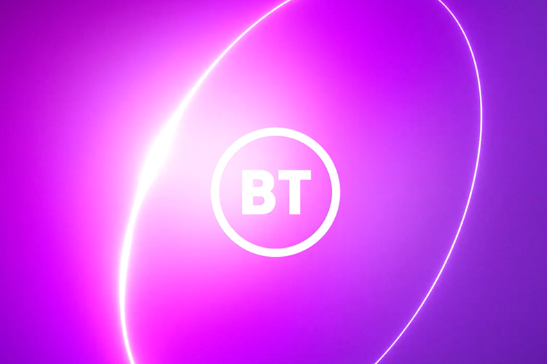
As a symbol of these changes and its new direction, BT introduced a new brand line, “Beyond Limits”, which represents its determination to go further than ever to connect more people and businesses across the UK, helping them make the most of technology and equipping them with the skills they need to release their potential. These ambitions are all intended to be symbolised by a new BT logo.
The BT name has been part of the company’s history for nearly 40 years, so it seems fitting that its importance has been retained and enhanced. For the first time, it is being used alone as a symbol not only of what BT has achieved, but also of what BT will achieve as a modern technology company, taking full advantage of emerging technologies.
The new BT logo is intended to be simpler and more memorable, which makes it ideal for use in both digital and physical environments, for all BT’s lines of business and on all types of media. The new BT logo is used in indigo, white or black, and indigo is also the core BT brand colour, supported by the colour pink. There is a new brand feature called the Portal, born from the new BT logo. This is BT’s main graphic asset. It is symbolic of a doorway to the world of BT’s networks, products and services. There are three Portal modes: Glimmer, Glow and Power. There are Portal animations and animations in which the new BT logo and the Portal are combined – namely, the BT Logo Loop Aura and the BT Logo Loop Hoola. There is also an animation of the new BT logo with the Beyond Limits brand line and the Portal. Together, these are BT’s new visual identity.
More than a logo
When the rebrand journey started, BT knew that a logo change alone was not enough to signal how much it has changed and its transition from a plain old telephone company to a modern technology company. So BT’s brand change forms part of a far larger picture – not merely a change of the brand’s symbol, but a symbol of the brand’s change.
For example, a TV ad developed for the rebrand campaign focuses on “skills for tomorrow”. First aired in October 2019, it follows the story of a young girl as she travels through modern Britain to reach her classroom of the future, concluding that this is a journey of optimism and pride and showing that technology can play a positive role in our lives. The ad begins with the girl citing the opening words of Charles Dickens’ A Tale of Two Cities: “It was the best of times, it was the worst of times”. Little did we know that within a matter of months the worst of times would be upon us, with a global pandemic affecting all our lives. Keeping the nation connected has never been more essential.
Trade mark filings have been made at both the UK IPO and the EUIPO to protect all aspects of the new BT identity: the BT logo, the “Beyond Limits” brand line, the Portal images and combined images of all the above in both static and animated form.
Filings have also been made in many of the other countries in which BT is active. As the company has existing trade mark registrations for BT and the connected world device in around 165 countries – and has also protected BT (alone) in any country in which it trades and where it is possible to do so – protecting the new BT logo was a simpler process than if the name BT were being used for the first time. However, the simplicity of the new BT logo presented registration challenges in those countries where two-letter, unpronounceable words are not acceptable. Even so, by being inventive, it was possible to come up with a form of the mark consisting of the new BT logo alongside its transliteration or translation in the local language and the relevant script (such as katakana, for Japan). That had the advantage of working well for the company as regards local use and enabled BT to achieve registration in each such country.
So, together with BT’s other brand assets, the latest logo is symbolic of a new journey for BT as it moves into an exciting technological future where everyone is included and challenged to go one step beyond.